
Adidas
adiClub refresh
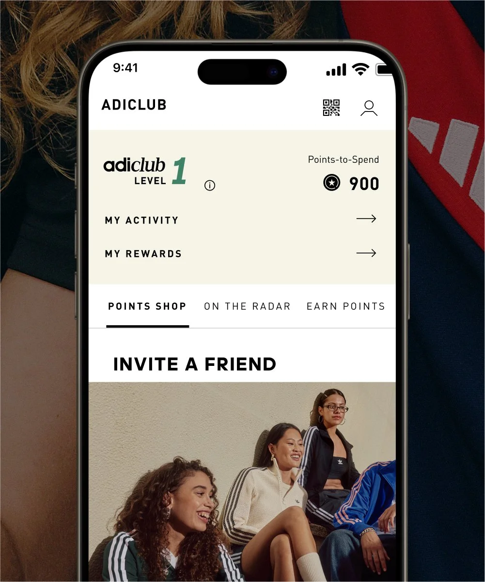
adiClub is adidas’ membership program. It’s free to join, open to everyone, and rewards members for their engagement with the brand.
Working with the team at Studio A, I led the refresh of its global visual identity. This included new guidelines and the creation of hundreds of assets.
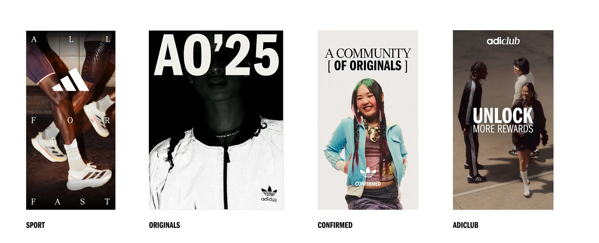
Brief: To refresh adiClub with a new look, feel and tone of voice that is aligned as an expression of the simplified adidas brand direction and the 2025 annual creative narrative – Power of Three.
Execution: The updated identity launched in 2025, bringing a new look, feel, and tone of voice. It reflects adidas’ simplified brand direction and the 2025 creative narrative, Power of Three.
Client: Adidas
Agency: Studio A
Role: Design Lead
#VisualIdentity #DigitalDesign #ToolkitDesign
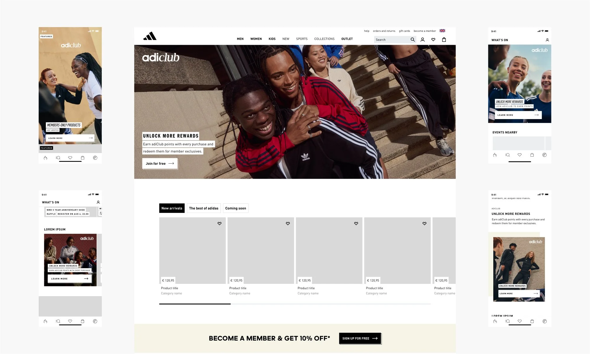
Project overview and rollout
As design lead, I worked with a team of four designers to refresh the adiClub visual identity. We updated the wordmark, aligned colours to the 2025 brand palette, refined typography, and developed iconography.
We delivered hundreds of digital assets along with multiple guidelines documents and toolkits, which were shared with global markets. The new identity will roll out across all touchpoints, including dotcom, the adidas flagship app, adidas running app, CRM, paid media, Confirmed app, and retail.
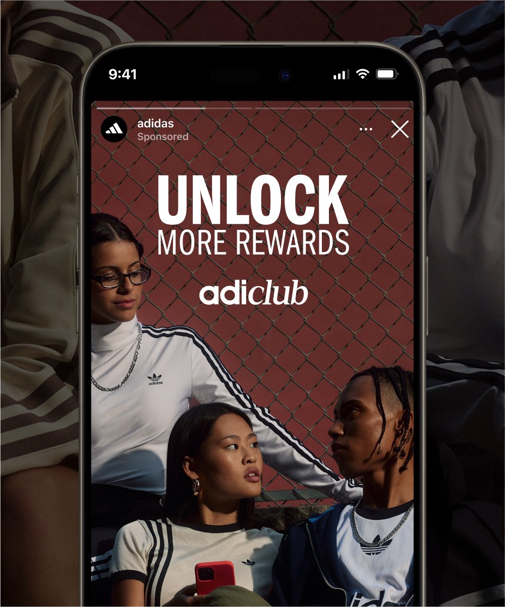
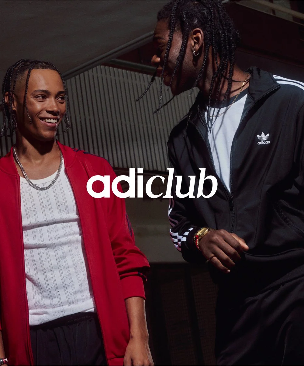

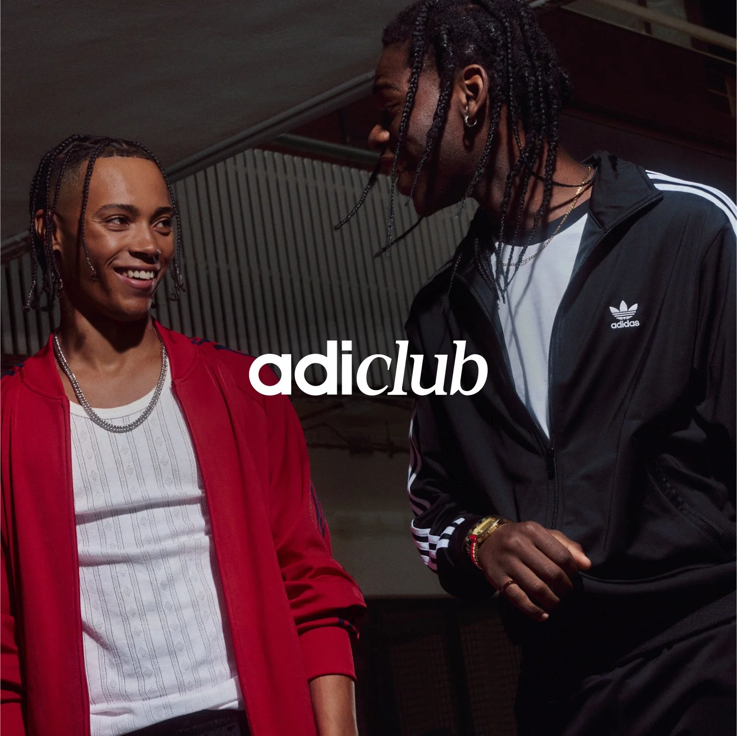
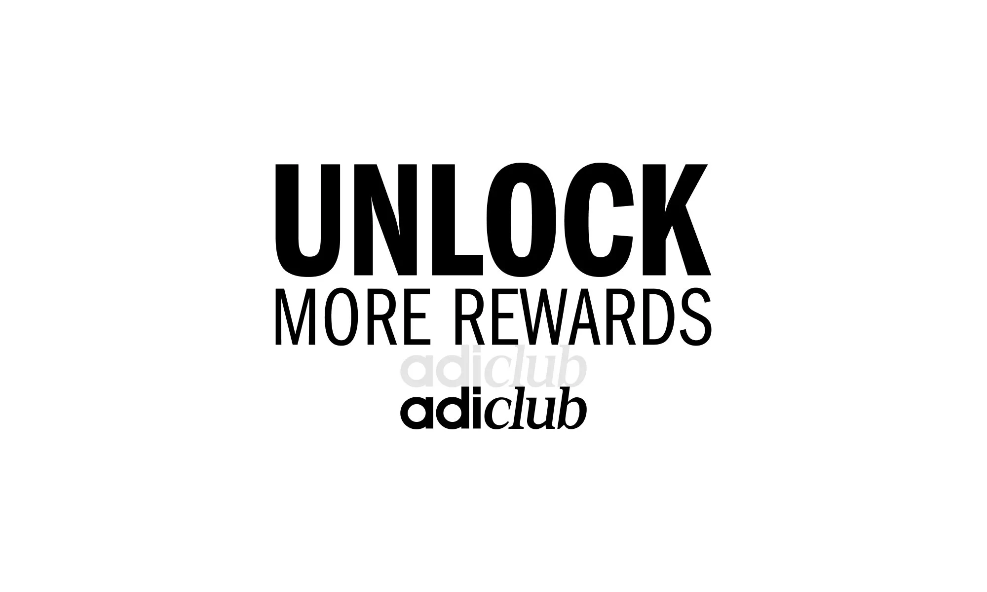
The adiClub wordmark
The adiClub wordmark was refreshed for 2025 to align with adidas brand fonts. It was designed to feel familiar while appearing more premium.
The wordmark was rigorously tested across multiple adidas environments to ensure it worked alongside other brand marks. This included testing placement and scale in different contexts to maintain consistency and clarity.
Typography
We worked within the adidas brand fonts but aimed to create a unique tone for adiClub. By using a mix of fonts in ways not seen elsewhere, we developed a typesetting style that feels approachable and slightly more playful than the more serious tones in other parts of the brand.
The goal was to reflect the member-focused nature of adiClub, encouraging engagement and making the experience feel welcoming.


Iconography
Icons were created as a core part of the adiClub experience, helping to show member rewards and ways to earn points. Since rewarding members is at the heart of the program, the icons needed to clearly highlight opportunities for engagement across digital and retail environments.
The icon library was built on a grid system and designed to feel approachable and welcoming. Colour was used intentionally to attract attention and support the member-focused tone of adiClub. Filled icons were chosen to ensure they stand out wherever rewards need to be identified.
This system created a consistent visual language that makes it easier for members to recognise rewards, understand how to earn points, and engage with the program.
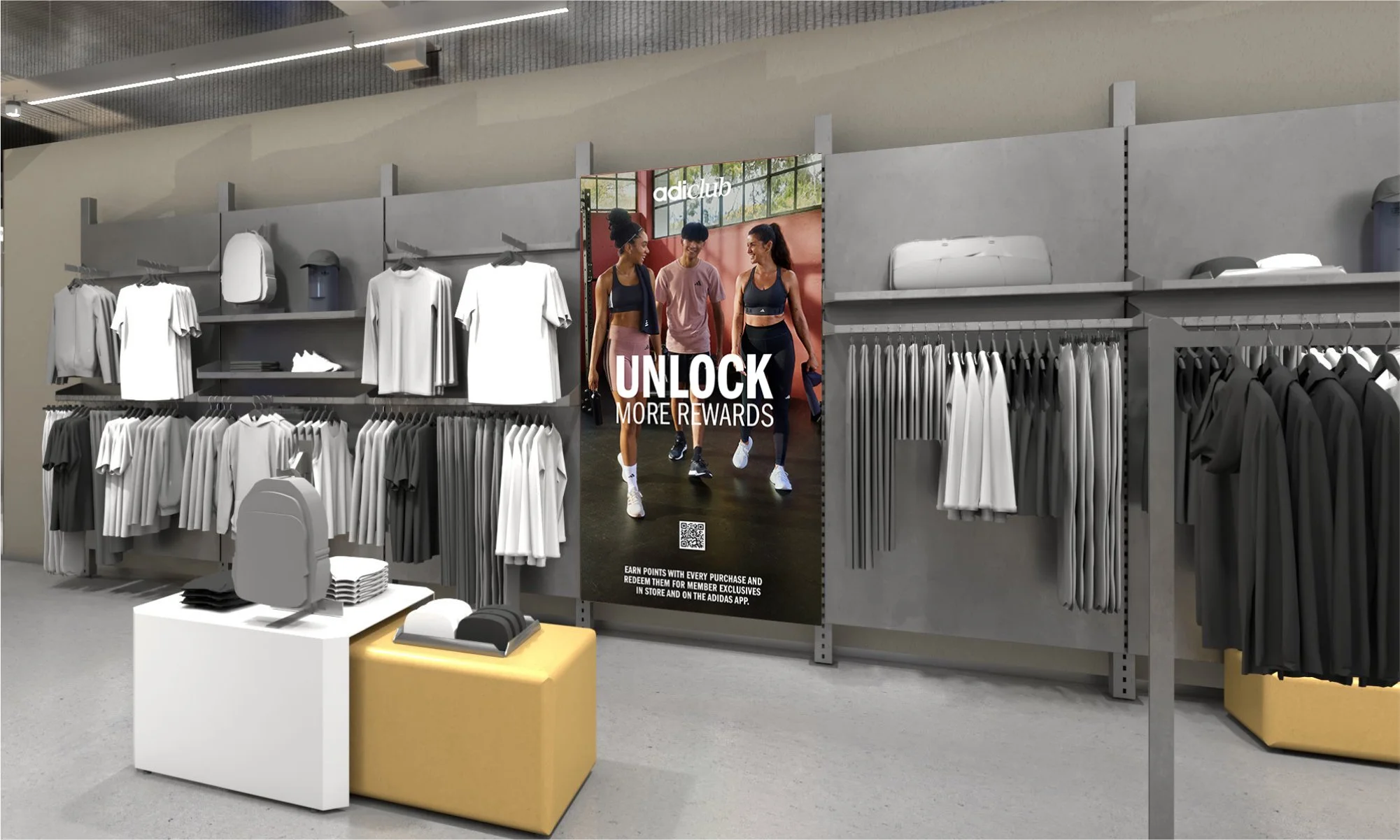
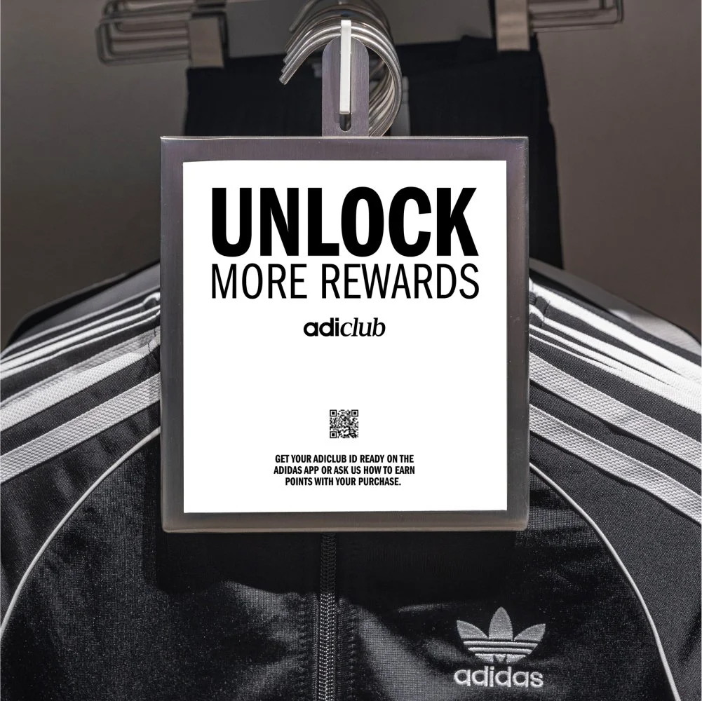
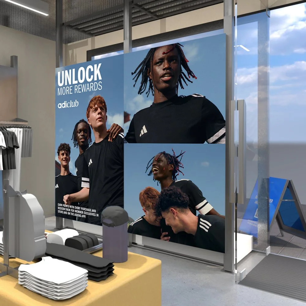
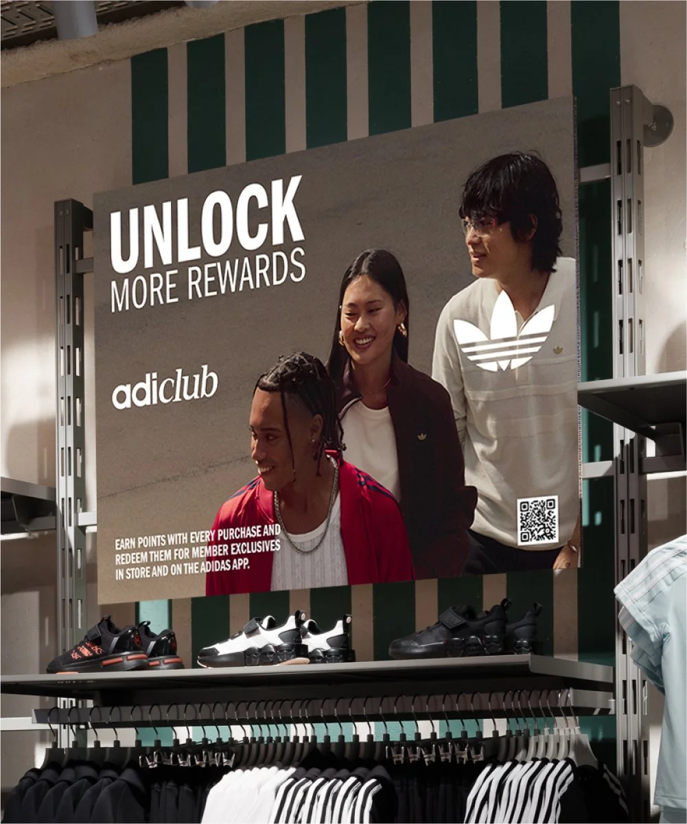
Retail
For retail, we refined and developed specific rules to adapt typography, iconography, and layouts for in-store use. This ensured that the adiClub identity worked consistently while addressing the unique needs of physical environments.
The Retail Toolkit provided additional guidance, including rules for copy at key touchpoints, extended layout and application systems, and a reduced set of icons and imagery tailored for retail. It also introduced a dedicated approach for QR journeys and partnerships. While aligned with the broader guidelines, retail required its own considerations to deliver a clear and effective in-store experience.